Being able to plot two or more lines on the same axis is a useful technique for comparing multiple data sets with comparative values. AppInsights lets you plot up to 5 series within one line graph widget, with the ability to mark each series with a unique color.
Please note: this tutorial is not service specific. You can use the line graph widget with a variety of different integrations, or using custom data. The instructions below assume that you have already successfully connected your data source to your line graph widget.
When you are ready to select a visualization for you data, select our line graph widget (not to be confused with the sparkline).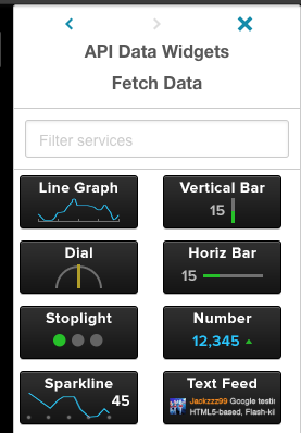
Click on the small gear icon on the widget and select the "Edit Widget Settings" menu.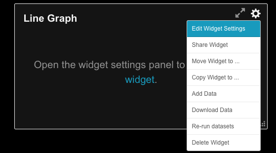
As normal, you will be defaulted to the standard "Data Settings" tab. On the right side of the window, you'll notice a column titled "Manage Series". From here, you can change the name of an existing series (1), change the color of the series (2), or add a new series (3).
If you add a new series, you'll want to be sure you tweak your data settings in some way, otherwise the series' settings will automatically be set to the defaults and you may end up with duplicate lines...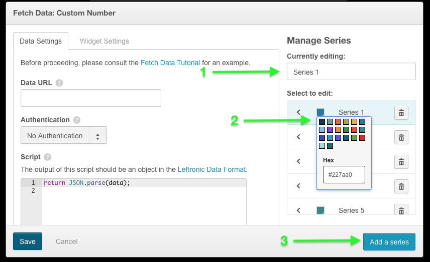
Please note: you can select from our default colors...or add a custom color using a hex color code. If you choose the latter, you must press the "enter" button on your keyboard after entering the hex code for the color change to be confirmed.
Once you are done, click the blue "Save" button and your data will appear in your widget.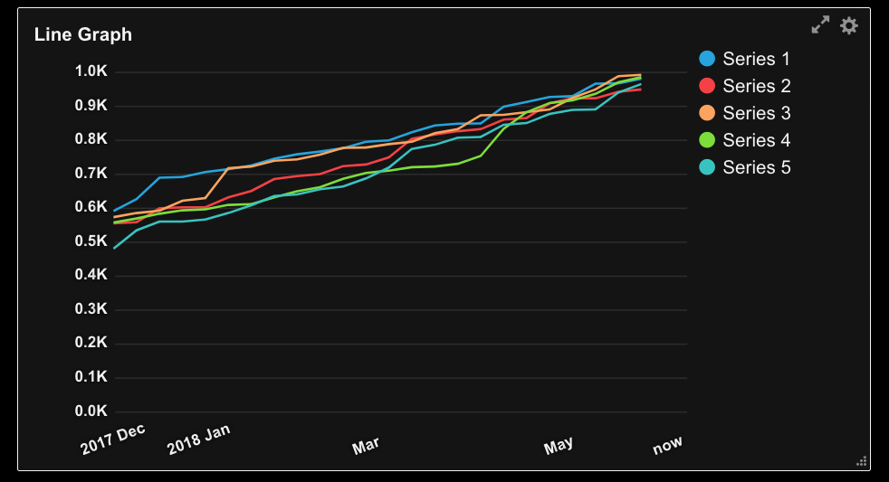
[AppInsights] Widgets - Line Graph: creating multiple series
Have more questions? Submit a request